Thursday, 13 May 2010
Wednesday, 5 May 2010
Tuesday, 4 May 2010
EVALUATION
1) In what way does your media product use, develop or challenge forms and conventions of media products?
 Our product could be produced by a major Hollywood studio, such as Warner Bros. If the full film was made it would have the potential of being a gripping psychological horror, as things such as make up, set, lighting and props could have much more money spent on them, making them much more believable. Being produced by a company such as TimeWarner, would mean that the film would have access to things like advertising. With it being such a big company and having lots of attributes, there would be opportunities to advertise on DVDs owned by the same company. Our film has similar features to Seven, such as the hate one character feels towards others, which, considering the success of Seven may be a crucial factor in whether a production company would take on a film like this. On the other hand, i believe that our film could also be successful if it was made on a low budget; it may not have the advantages of special effects etc. but it would make the film more gritty and believable.
 As opposed to Hollywood blockbusters, an Independent company from England could take up the film and produce a really chilling and intense film. I think that this would mean that the rating would go up to an 18. Here is a link to the BBFC website, which contains the guidelines for rating films: http://www.bbfc.co.uk/ This is our logo for an independent production company: 4) Who would be the audience for your media product?
The target audience for our film are between 15 and 25. The film may appeal to girls more than boys because of the lead roles are all female, however I don't think that this would stop a boy from watching it at all. With the themes of jealousy, rivalry and revenge in the film, a girl may understand it more as stereotypically girls could empathise with the stress of such a situation.
This is the logo for a 15 classification.
See this link for more research that I have done on Film Ratings: http://bcasmedia-group26.blogspot.com/2010/04/research-uk-film-rating-history.html
Our film will definately be a 15, as we didn't intend to show explicit scenes containing violence, we only wanted to create an impression that they would be happening. It should not be shown to anyone younger than 15 as it may be inappropriate to do so because of strong language, reference to violence and distressing psychological issues, which may upset the viewer.
Here is a link to my audience research that I did initially: http://bcasmedia-group26.blogspot.com/2010/04/initial-questionnaire-and-results.html
5) How did you attract/address your audience?
Dialogue was one of the ways we tried to attract our target audience. Being from Barnsley, the actors had strong accents, so they tried hard to tone down the dialect so that it seemed more generic and on a level with what people would call a 'normal' voice, so as not to put them off. We also tried to make Rhiannon and Laura, who played Kate and Scarlett, appear to dress stereotypically girly, for example with flowery dresses, to emphasise the fact that in our film there are underlying femenine issues, like feeling second best to others. The setting, too, reflects this. The opening scene is set in Kate's bedroom - we decided that it would be a good place to shoot because, again, it's a setting that is familiar with a lot of people; the not completely tidy yet not a complete mess that is a teenagers bedroom. We also used the kitchen, which
We decided that we wanted the film to be more from Kates point of view, so the audience would feel sympathy towards her. We did this by doing point of view shots, to make Scarlett seem much more sinister and aggressive, and make Scarlett seem misunderstood.
6) What have you learnt about technology from the process of constructing the product?
The camera we used was a Sony HDV 1000. Compared to the quality that we would have got from a JVC, HDVs are a lot better. The focus on the camera was quick and accurate, which meant that we didn't have to reshoot many scenes at all. The only down side to this camera was the sound; if we'd have had a boom microphone and recorded the sound seperately, it would have improved the overall quality. We expierienced a couple of problems while filming; we thought at one point that the tripod had broke, bubut we hadn't, it was just stuck. We also ran out of time one day to film, so we had to go back a week later and shoot an extra scene. The problem we faced then was editing the film to get the lighting to match the other scene right. It was also quite a challenge in places to film exactly the shots we wanted. The camera is quite big and heavy on the tripod, and in a small room it's hard to adjust the tripod and camera to get right where it's needed.
Now that we have completed the process of creating a film, we learnt quite a few things, especially from our preliminary task. Planning is very important, and research in to genre and other films is the best way to achieve good foundations to create a successful film. We also found that story boarding and listing shots were useful and allowed us to manage out time much better than when we did out preliminary task. In particular, I think my attention to continuity errors in particular has improved a lot and when editing I tried really hard to make sure we didn't have any.
I feel a lot more confident with using both the editing software and the camera equipment. I think that our film is successfull in most ways, however I think things that were beyond our control (like timing) were factors that reduced the quality more.
Here is a link to our target audience reaction : http://www.youtube.com/watch?v=zUHRidOdyMI
These are some of the comments that they made:
"Intriguing music because I linked with the horror genre, but i got a bit confusing at the end untill I realised it was a flashback"
"Camera angles were good, and showed who had the power"
These comments are useful, and are things that we should definately take on board for if we should ever do this again, or improve the film.
The genre of our film is horror, and having certain conventions such as blood in it represents this. Blood appears at the end of the opening scene, where Scarlett (the possessed psycho in the film) attacks Kate (the victim) and appears to have gouged a symbol on her shoulder. The fact that we have used the idea of someone being possessed makes our film a psychological horror, which is a sub-genre of the wide spectrum of Horror. We decided to use symbols as a means of how Scarlett has become possessed, with the ideas and connotations of ancient black magic. The use of these conventions are not in exactly as you would imagine in a horror: for example, the blood isn't everywhere and it isn't explicitly graphic. The reason why it is a horror is because of the psychological reasoning behind the act of it; it isn't classed as normal and is intended to scare the audience. Compare to the opening titles of Se7en our film has both similarities and differences. We used inspiration from the film to create shifting, shaky text, and also the idea of having images in the background. The differences are that in Se7en the images are moving. We decided that this may be too complex for our film and the time we had to do it, and so we decided that we would use a still picture of the symbols featured in one of the scenes.
Se7en's opening title
Our Opening title
2) How does your media product represent particular social groups?
There are two social groups that our film particularly covers, that can be classed as one: teenage girls. The idea of jealousy and rivalry between two sisters appealed to us, as we thought it could be something that girls of that age could understand and relate to, in a way. Stereotypically, girls teenagers in particular) are assumed to behave rashly when they aren't happy with a situation and strive to change it. This would make our film appeal slightly more to girls, however it's not totally aimed at them and can be watched by anyone. Compared to Se7en, our film is quite the opposite. In Seven, the two main characters have only just met, purely through work. In the the scene the screenshot below taken from (in the film) the two characters are walking down the street. At this point the audience don't know exactly who is the more dominant figure, so as they are walking they change sides, which makes one look bigger than the other at different times. In our film, the two main characters are sisters. In the scene that they are together, to emphasise the dominance that Scarlett has she is stood up, towering over her sister Kate, who is sat down.
3) What kind of media institution might distribute your media product and why?
 Our product could be produced by a major Hollywood studio, such as Warner Bros. If the full film was made it would have the potential of being a gripping psychological horror, as things such as make up, set, lighting and props could have much more money spent on them, making them much more believable. Being produced by a company such as TimeWarner, would mean that the film would have access to things like advertising. With it being such a big company and having lots of attributes, there would be opportunities to advertise on DVDs owned by the same company. Our film has similar features to Seven, such as the hate one character feels towards others, which, considering the success of Seven may be a crucial factor in whether a production company would take on a film like this. On the other hand, i believe that our film could also be successful if it was made on a low budget; it may not have the advantages of special effects etc. but it would make the film more gritty and believable.
  As opposed to Hollywood blockbusters, an Independent company from England could take up the film and produce a really chilling and intense film. I think that this would mean that the rating would go up to an 18. Here is a link to the BBFC website, which contains the guidelines for rating films: http://www.bbfc.co.uk/ This is our logo for an independent production company:
 The target audience for our film are between 15 and 25. The film may appeal to girls more than boys because of the lead roles are all female, however I don't think that this would stop a boy from watching it at all. With the themes of jealousy, rivalry and revenge in the film, a girl may understand it more as stereotypically girls could empathise with the stress of such a situation.
This is the logo for a 15 classification.
See this link for more research that I have done on Film Ratings: http://bcasmedia-group26.blogspot.com/2010/04/research-uk-film-rating-history.html
Our film will definately be a 15, as we didn't intend to show explicit scenes containing violence, we only wanted to create an impression that they would be happening. It should not be shown to anyone younger than 15 as it may be inappropriate to do so because of strong language, reference to violence and distressing psychological issues, which may upset the viewer.
Here is a link to my audience research that I did initially: http://bcasmedia-group26.blogspot.com/2010/04/initial-questionnaire-and-results.html
5) How did you attract/address your audience?
Dialogue was one of the ways we tried to attract our target audience. Being from Barnsley, the actors had strong accents, so they tried hard to tone down the dialect so that it seemed more generic and on a level with what people would call a 'normal' voice, so as not to put them off. We also tried to make Rhiannon and Laura, who played Kate and Scarlett, appear to dress stereotypically girly, for example with flowery dresses, to emphasise the fact that in our film there are underlying femenine issues, like feeling second best to others. The setting, too, reflects this. The opening scene is set in Kate's bedroom - we decided that it would be a good place to shoot because, again, it's a setting that is familiar with a lot of people; the not completely tidy yet not a complete mess that is a teenagers bedroom. We also used the kitchen, which
We decided that we wanted the film to be more from Kates point of view, so the audience would feel sympathy towards her. We did this by doing point of view shots, to make Scarlett seem much more sinister and aggressive, and make Scarlett seem misunderstood.
6) What have you learnt about technology from the process of constructing the product?
The camera we used was a Sony HDV 1000. Compared to the quality that we would have got from a JVC, HDVs are a lot better. The focus on the camera was quick and accurate, which meant that we didn't have to reshoot many scenes at all. The only down side to this camera was the sound; if we'd have had a boom microphone and recorded the sound seperately, it would have improved the overall quality. We expierienced a couple of problems while filming; we thought at one point that the tripod had broke, bubut we hadn't, it was just stuck. We also ran out of time one day to film, so we had to go back a week later and shoot an extra scene. The problem we faced then was editing the film to get the lighting to match the other scene right. It was also quite a challenge in places to film exactly the shots we wanted. The camera is quite big and heavy on the tripod, and in a small room it's hard to adjust the tripod and camera to get right where it's needed.
The editing software we used was Final Cut Express on an Apple Mac. I learnt how to use a DV recorder and to import the shots from tape to the Mac. Before I began to edit, I named the shots and then put them in a rough playing order so that it would make assembling the film much easier, and less confusing. This meant that I could move the clips and then cut them into time. Because we didn't have an additional microphone, when we moved the camera the sound of the bacon sizzling changes volume, so to make the shots flow better I used cross fades to make the changing of the sound less obvious. To make the titles, as a group we spent a lot of time trying to choose something suitable. We decided that using lowercase would look good. We also spent a long time picking the right music for our film, although we didn't have a lot of choice for copyright reasons.
7. Looking back to your preliminary tast, what do you feel that you have learnt in the progression from it to the full product?Now that we have completed the process of creating a film, we learnt quite a few things, especially from our preliminary task. Planning is very important, and research in to genre and other films is the best way to achieve good foundations to create a successful film. We also found that story boarding and listing shots were useful and allowed us to manage out time much better than when we did out preliminary task. In particular, I think my attention to continuity errors in particular has improved a lot and when editing I tried really hard to make sure we didn't have any.
These are screen shots of our shot reverse shots for our preliminary task.
These are screen shots of our shot reverse shots for out Horror film.
Compared to our Horror film, the preliminary shots don't looks very good; the framing is poor as there is too much of the walls and background in the shots. We could have used the zoom button or even moved the camera to re-angle, but at the time it was out first attempt and we were please.
Now our faming is much better; there isnt a lot of wasted space in the frame, so the eye is not drawn to any where else but the person talking. One thing I think we did better on the preliminary task though, was that we framed the shot so that the heads were on the same level, therefore making the cut between the two look even smoother and easier to follow with the eyes.
I feel a lot more confident with using both the editing software and the camera equipment. I think that our film is successfull in most ways, however I think things that were beyond our control (like timing) were factors that reduced the quality more.
Here is a link to our target audience reaction : http://www.youtube.com/watch?v=zUHRidOdyMI
These are some of the comments that they made:
"Intriguing music because I linked with the horror genre, but i got a bit confusing at the end untill I realised it was a flashback"
"Camera angles were good, and showed who had the power"
These comments are useful, and are things that we should definately take on board for if we should ever do this again, or improve the film.
Film Analysis: Se7en
To start with, we see one of the main characters begin to get dressed. There is a medium shot of him in a mirror putting on a tie, which implies importance in his job. After this opening scene it cuts straight into a tilt of someone laid dead on the floor surrounded by blood. Blood is an obvious convention of horror. The lighting in this scene is dark, but the light reflects off the blood making it look much fresher and more sinister. It’s interesting to see that the 25degree rule isn’t used at this point; after the close up of Morgan Freeman’s face while he is looking at a board, we can see another figure stood in a door way behind him. The shot then cuts to a medium shot of the man behind him, without moving position in the hallway. In the background there is blood on the blind, which is emphasized by the contrast in the colours. Brad Pitt then enters, and the lighting illuminates his face from the side, casting dramatic shadows. This foreshadows his importance in the film.
The next scene is outside as they are walking away from the crime scene. The camera tracks with them, and always views them in a low angle shot. This emphasizes their importance. They continuously move sides so no one person is constantly at the front of the shot. This shows that the status between the two of the characters isn't set, so we don't know who's going to be more important.
The titles of this film are quite horrific. They leave the audience wondering what's happening and wanting to know more. The words are shaky and disjointed, which possibly reflects the killer in the film's fame of mind. We see a lot of close ups of his hands as he shaves his fingerprints off, and sews paper. At this point the audience have no idea what's happening, and the tense non-diegetic music adds to the suspence.
Final Evaluation
1. In what way does your media product use, develop or challenge forms an conventions of media products?
The generic conventions of horror films are quite specific as it is important that the film does not become a thriller. Villains and victims are 2 generic conventions of horror films. These are quite prominent in our film. The two main characters are the villain and victim of the film they are the main focus. Darkness, fear, viol ence and screams are also main generic conventions of horror films, which we have used in the first scene of our film, in the bedroom. The room is really dark until Kate turns the lamp on, and when Scarlett attacks her there is a point of view shot which clearly shows the fear on Kate’s face, this is also where we incorporated screaming.
As our film starts with a flashback the villain and victim are shown straight away, the introduction to these characters is shown later in the film. We chose to do this to make the audience start asking questions as to what has happened to Scarlett, rather than giving them all the information straight away. Horror films u sually include gore, but the branding scar in our film isn’t too over-the-top as this wouldn’t suit the rating of our film. This challenges that particular generic convention.
I think the way in which we have used conventions indicate the sub-genre of our film, psychological horror. The use of darkness, fear and screaming all set a scary, mysterious mood. The violence of the attack is also a generic convention of horror which we emphasise with slow motion effects. Also, the scene which shows assumed normality in the household, in the kitchen, also makes the audience sense something unusual is going on with Scarlett which isn’t physically apparent.
2. How does your media product represent particular social groups?
The characters in our film are all female. The character with the main focus is Scarlett. She has quite a prominent personality in the first scene, which goes against the stereotypical interpretation of a female. She is aggressive and forwa rd and doesn’t seem to be the usual passive reserved female. However in the next scene, in the kitchen, we see that she is actually a quiet girl. In this scene she is more fitting to the stereotype, however she seems to have something bothering her, the possession and branding. The mother is represented in a stereotypical way; she comes across as pleasant and friendly and is also seen to be cooking.
In our opening sequence, the villain and the victim are highlighted straight away, whereas in The Omen, a similar psychological horror film the characters are slightly more mysterious. It is alot less apparent and just hinted at through the use of non-digetic music and close up shots.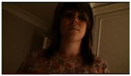
The generic conventions of horror films are quite specific as it is important that the film does not become a thriller. Villains and victims are 2 generic conventions of horror films. These are quite prominent in our film. The two main characters are the villain and victim of the film they are the main focus. Darkness, fear, viol
 ence and screams are also main generic conventions of horror films, which we have used in the first scene of our film, in the bedroom. The room is really dark until Kate turns the lamp on, and when Scarlett attacks her there is a point of view shot which clearly shows the fear on Kate’s face, this is also where we incorporated screaming.
As our film starts with a flashback the villain and victim are shown straight away, the introduction to these characters is shown later in the film. We chose to do this to make the audience start asking questions as to what has happened to Scarlett, rather than giving them all the information straight away. Horror films u
 sually include gore, but the branding scar in our film isn’t too over-the-top as this wouldn’t suit the rating of our film. This challenges that particular generic convention.
I think the way in which we have used conventions indicate the sub-genre of our film, psychological horror. The use of darkness, fear and screaming all set a scary, mysterious mood. The violence of the attack is also a generic convention of horror which we emphasise with slow motion effects. Also, the scene which shows assumed normality in the household, in the kitchen, also makes the audience sense something unusual is going on with Scarlett which isn’t physically apparent.
2. How does your media product represent particular social groups?
The characters in our film are all female. The character with the main focus is Scarlett. She has quite a prominent personality in the first scene, which goes against the stereotypical interpretation of a female. She is aggressive and forwa
 rd and doesn’t seem to be the usual passive reserved female. However in the next scene, in the kitchen, we see that she is actually a quiet girl. In this scene she is more fitting to the stereotype, however she seems to have something bothering her, the possession and branding. The mother is represented in a stereotypical way; she comes across as pleasant and friendly and is also seen to be cooking.
In our opening sequence, the villain and the victim are highlighted straight away, whereas in The Omen, a similar psychological horror film the characters are slightly more mysterious. It is alot less apparent and just hinted at through the use of non-digetic music and close up shots.

3.What kind of media institution might distribute your media product and why?  I think our film is something that could be produced by a major Hollywood such as 20th Century Fox, because it features characters that are marketable, and also it would appeal to a large audience. Our film has some similar elements to ‘The Omen’. They both have a lot of quick cuts and screaming and also, in the omen, the child is the antichrist and has ‘666’ branded on his scalp, which proves ours would be successful. Some elements of our film would be even more effective if it was to be created by a Hollywood studio, such as the scar created when Scarlett is branded. When done by a professional team of makeup artists who have access to special effects makeup and prosthetics it would look even more realistic. Furthermore, there are lots of opportunities for advertisement and marketing. The fact that the certificate of the film is only a 15 and not an 18 means that it could be advertised on billboards and on buses. A trailer of our film including shots used in it could be shown on the internet, or at the beginning of other films being shown in the cinema. The trailer wouldn’t give too much away, but enough to captivate an audience and make them want to see the full film to find out what happens.
I think it would be a film that would be shown in larger cinemas such as Vue or Cineworld. Its rating would mean it would attract a large audience and also, the fact that it has some similar elements to existing popular horror films would mean that it would have a good viewing rate. Also, I think it could be shown as a TV movie, after its initial release in cinemas, but it would have to be shown in the evening due to the restrictions of the certificate.
Another reason our film could be produced by a major Hollywood studio is that it has a lot of opportunities for merchandising. A lot of horror films have dolls or models of the evil character for sale, I think this would work well with the story of our film. I think that posters and soundtracks would also sell well as merchandise, using still images from our film.
4. Who would be the audience for your media product?
The target audience of our film is limited slightly by the age certificate. I think there is no particular gender target, as horror films often appeal to both males and females. We wanted our film to attract a wide audience and therefore tried to include factors that didn’t really focus on one particular gender. I think people that are at the bottom end of the age range may find some of it a bit harder to understand, such as the use of the alchemy symbols. Another thing that could be confusing to younger people is the fact that it starts with a flashback. In our audience/certificate research we found that we would not be able to use too much bad language or violence. We managed to stick to these criteria well, there was no real need to include these things so it wasn’t difficult to avoid using them.
The classification of our film, as I have mentioned, is 15. I think this is the most suitable of all the classification criteria as our film fits in all the guidelines. The BBFC website states the classification of this certificate (http://www.bbfc.co.uk/downloads/pub/Guidelines/BBFC%20Classification%20Guidelines%202009.pdfo.uk/downloads/pub/Guidelines/BBFC%20Classification%20Guidelines%202009.pdf ); it says “Violence may be strong but should not dwell on the infliction of pain or injury”. We have kept our film within this guideline, we don’t actually show Scarlett branding her sister, only the mark she leaves as that is the important part. Also on the topic of violence, it says “Dangerous behaviour (or example, hanging, suicide and self-harming) should not dwell on detail which could be copied. Easily accessible weapons should not be glamorised.” This is something which we have achieved by not actually showing Scarlett creating the brand on her sister, and also, she doesn’t actually use a weapon, she does it by scratching with her nails.
‘The Omen’ is similar to ours, it has certificate 18 and would therefore appeal to a slightly older audience to ours. It is a lot more gory and graphic than our film and is certainly a lot more disturbing. I think the exorcist would appeal to a male-majority audience as it is extremely disturbing.
5. How did you attract/address your audience?
The age of our target audience is 15-35, but there is no particular target gender. I think the fact that our film starts with a flashback rather than being in chronological order could make it slightly difficult for the lowest end of our age range to understand and the attack. The audience will obviously have an interest in horror films, this is why our clip starts with a flashback, so the audience are drawn to the action straight away.
 The use of point of view shots puts the camera in the position of both main characters at various points. I think this is important when trying to scare them as they see what both Scarlett and Kate see, especially in the attack. They don’t actually witness Scarlett branding Kate, they just see a close up of the mark she leaves. I think the elusiveness of this is more likely to put the audience on edge than if we’d have shown the whole thing. Also, another point of view shot that helps to build suspense is before the attack. Kate is woken from her sleep by the rattling door handle, the audience only see the door handle, and Scarlett’s hand, until she actually approaches Kate and they see her in a medium shot.
6. What have you learnt about technology from the process of constructing the product?
To make our film we used a Sony HDV 1000. This camera was really useful as it had its own microphone. This made editing a lot less time consuming than it would have been with a separate sound. Although our film doesn’t really include much speech until the final scene. Also, the camera has a good auto function which meant we didn’t really have to worry about the image being out of focus. The battery life of the camera was really good, meaning we didn’t have any interruptions when we were filming, this helped us to avoid continuity errors. One problem we found with the camera was the size of it. The rooms in which we were filming were quite small, and to get the most effective shots we often needed to shoot from the corners of the room, this was difficult because the camera is so big.
The only problem we faced was that at first we thought the tripod was broken. The legs didn’t extend properly; therefore we found it hard to get the camera stable and level. When we looked at it more closely we noticed that it wasn’t actually broken just hadn’t been put away properly and the poles in the legs were out of place. It worked fine when we solved this. To stop it from happening again we were more careful when we were putting it away.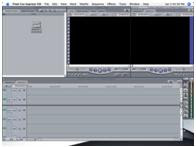
To edit our film we used ‘Final Cut Express’. This software is really useful as it has functions that allowed us to add special effects to our movie, we used most of these during the attack scene. We used white flashes in between shots of Kate being restless in bed and then a slow motion shot as Scarlett attacks Kate. We also used this software to create our title sequence as it has functions that made the text appear shadowed and shaky and also allowed us to edit the overall look of the background image we used. We got the ideas for our title sequence from a film called The Wasp Factory. The editing process was time consuming as we have used a lot of different shots so we had to make sure the continuity was good and also that they flowed well.
7.Looking back to your preliminary task, what do you feel that you have learnt in the progression from it to the full product?
When planning our film we started by deciding which genre we wanted to use. We thought horror would be most interesting, especially for the research aspect of our project, we then watched various horror films and began to create a spider diagram of ideas. When we decided on the basic theme of the film we began to plan the story line and script. A lot of the research we did into genre and generic conventions was done through the internet on websites such as www.imdb.com/chart/horror. We did a list of all the shots we planned to use, in order and also what they would include. This detailed plan of the shots came in very useful when we were capturing the film as we knew exactly what we needed to do. I think this saved us a lot of time! Compared to the planning we did in the preliminary task, this time round we went into a lot more detail. We did a lot more research to make sure the things we included were relevant to the genre and also did storyboarding and plans which helped the whole process be a lot smoother.
 In the preliminary task the range of shots we used was very limited. Also, the composition of our shots was really poor, as shown in this example of one of our shot-reverse-shots. I think we did alot better in this final project at making the shots look alot more professional and precise. It was one of the first filming tasks we had done and the camera was really small. I think the fact that the equipment we used this time was a lot more advanced meant that we could do a lot more with it. In particular we used a lot of point of view shots. These show the audience what the characters are looking at, such as when Kate looks at the rattling door handle, Scarlett looks at the branding mark on Kate’s back and also when Kate finds the sheet of alchemy symbols in Scarlett’s book. I think that as a group we worked with the equipment a lot better by the end of the task than we did during the preliminary task.
I think our end product is really successful at fulfilling the task. Our film is at least 2 minutes long and is part of a full horror movie. I think we did a lot of good detailed research and planning which resulted in the actual making of our film really successful.
 I think our film is something that could be produced by a major Hollywood such as 20th Century Fox, because it features characters that are marketable, and also it would appeal to a large audience. Our film has some similar elements to ‘The Omen’. They both have a lot of quick cuts and screaming and also, in the omen, the child is the antichrist and has ‘666’ branded on his scalp, which proves ours would be successful. Some elements of our film would be even more effective if it was to be created by a Hollywood studio, such as the scar created when Scarlett is branded. When done by a professional team of makeup artists who have access to special effects makeup and prosthetics it would look even more realistic. Furthermore, there are lots of opportunities for advertisement and marketing. The fact that the certificate of the film is only a 15 and not an 18 means that it could be advertised on billboards and on buses. A trailer of our film including shots used in it could be shown on the internet, or at the beginning of other films being shown in the cinema. The trailer wouldn’t give too much away, but enough to captivate an audience and make them want to see the full film to find out what happens.
I think it would be a film that would be shown in larger cinemas such as Vue or Cineworld. Its rating would mean it would attract a large audience and also, the fact that it has some similar elements to existing popular horror films would mean that it would have a good viewing rate. Also, I think it could be shown as a TV movie, after its initial release in cinemas, but it would have to be shown in the evening due to the restrictions of the certificate.
Another reason our film could be produced by a major Hollywood studio is that it has a lot of opportunities for merchandising. A lot of horror films have dolls or models of the evil character for sale, I think this would work well with the story of our film. I think that posters and soundtracks would also sell well as merchandise, using still images from our film.
4. Who would be the audience for your media product?
The target audience of our film is limited slightly by the age certificate. I think there is no particular gender target, as horror films often appeal to both males and females. We wanted our film to attract a wide audience and therefore tried to include factors that didn’t really focus on one particular gender. I think people that are at the bottom end of the age range may find some of it a bit harder to understand, such as the use of the alchemy symbols. Another thing that could be confusing to younger people is the fact that it starts with a flashback. In our audience/certificate research we found that we would not be able to use too much bad language or violence. We managed to stick to these criteria well, there was no real need to include these things so it wasn’t difficult to avoid using them.

The classification of our film, as I have mentioned, is 15. I think this is the most suitable of all the classification criteria as our film fits in all the guidelines. The BBFC website states the classification of this certificate (http://www.bbfc.co.uk/downloads/pub/Guidelines/BBFC%20Classification%20Guidelines%202009.pdfo.uk/downloads/pub/Guidelines/BBFC%20Classification%20Guidelines%202009.pdf ); it says “Violence may be strong but should not dwell on the infliction of pain or injury”. We have kept our film within this guideline, we don’t actually show Scarlett branding her sister, only the mark she leaves as that is the important part. Also on the topic of violence, it says “Dangerous behaviour (or example, hanging, suicide and self-harming) should not dwell on detail which could be copied. Easily accessible weapons should not be glamorised.” This is something which we have achieved by not actually showing Scarlett creating the brand on her sister, and also, she doesn’t actually use a weapon, she does it by scratching with her nails.
‘The Omen’ is similar to ours, it has certificate 18 and would therefore appeal to a slightly older audience to ours. It is a lot more gory and graphic than our film and is certainly a lot more disturbing. I think the exorcist would appeal to a male-majority audience as it is extremely disturbing.
5. How did you attract/address your audience?
The age of our target audience is 15-35, but there is no particular target gender. I think the fact that our film starts with a flashback rather than being in chronological order could make it slightly difficult for the lowest end of our age range to understand and the attack. The audience will obviously have an interest in horror films, this is why our clip starts with a flashback, so the audience are drawn to the action straight away.
 The use of point of view shots puts the camera in the position of both main characters at various points. I think this is important when trying to scare them as they see what both Scarlett and Kate see, especially in the attack. They don’t actually witness Scarlett branding Kate, they just see a close up of the mark she leaves. I think the elusiveness of this is more likely to put the audience on edge than if we’d have shown the whole thing. Also, another point of view shot that helps to build suspense is before the attack. Kate is woken from her sleep by the rattling door handle, the audience only see the door handle, and Scarlett’s hand, until she actually approaches Kate and they see her in a medium shot.
6. What have you learnt about technology from the process of constructing the product?

To make our film we used a Sony HDV 1000. This camera was really useful as it had its own microphone. This made editing a lot less time consuming than it would have been with a separate sound. Although our film doesn’t really include much speech until the final scene. Also, the camera has a good auto function which meant we didn’t really have to worry about the image being out of focus. The battery life of the camera was really good, meaning we didn’t have any interruptions when we were filming, this helped us to avoid continuity errors. One problem we found with the camera was the size of it. The rooms in which we were filming were quite small, and to get the most effective shots we often needed to shoot from the corners of the room, this was difficult because the camera is so big.
The only problem we faced was that at first we thought the tripod was broken. The legs didn’t extend properly; therefore we found it hard to get the camera stable and level. When we looked at it more closely we noticed that it wasn’t actually broken just hadn’t been put away properly and the poles in the legs were out of place. It worked fine when we solved this. To stop it from happening again we were more careful when we were putting it away.

To edit our film we used ‘Final Cut Express’. This software is really useful as it has functions that allowed us to add special effects to our movie, we used most of these during the attack scene. We used white flashes in between shots of Kate being restless in bed and then a slow motion shot as Scarlett attacks Kate. We also used this software to create our title sequence as it has functions that made the text appear shadowed and shaky and also allowed us to edit the overall look of the background image we used. We got the ideas for our title sequence from a film called The Wasp Factory. The editing process was time consuming as we have used a lot of different shots so we had to make sure the continuity was good and also that they flowed well.
7.Looking back to your preliminary task, what do you feel that you have learnt in the progression from it to the full product?
When planning our film we started by deciding which genre we wanted to use. We thought horror would be most interesting, especially for the research aspect of our project, we then watched various horror films and began to create a spider diagram of ideas. When we decided on the basic theme of the film we began to plan the story line and script. A lot of the research we did into genre and generic conventions was done through the internet on websites such as www.imdb.com/chart/horror. We did a list of all the shots we planned to use, in order and also what they would include. This detailed plan of the shots came in very useful when we were capturing the film as we knew exactly what we needed to do. I think this saved us a lot of time! Compared to the planning we did in the preliminary task, this time round we went into a lot more detail. We did a lot more research to make sure the things we included were relevant to the genre and also did storyboarding and plans which helped the whole process be a lot smoother.
 In the preliminary task the range of shots we used was very limited. Also, the composition of our shots was really poor, as shown in this example of one of our shot-reverse-shots. I think we did alot better in this final project at making the shots look alot more professional and precise. It was one of the first filming tasks we had done and the camera was really small. I think the fact that the equipment we used this time was a lot more advanced meant that we could do a lot more with it. In particular we used a lot of point of view shots. These show the audience what the characters are looking at, such as when Kate looks at the rattling door handle, Scarlett looks at the branding mark on Kate’s back and also when Kate finds the sheet of alchemy symbols in Scarlett’s book. I think that as a group we worked with the equipment a lot better by the end of the task than we did during the preliminary task.
I think our end product is really successful at fulfilling the task. Our film is at least 2 minutes long and is part of a full horror movie. I think we did a lot of good detailed research and planning which resulted in the actual making of our film really successful.
A sample of our target audience (male and female 17 year olds) watched our film and gave us feedback of what they though. Some of the comments they gave were that it fitted the genre of horror well, and that it was intriuging...making the audience want to know what happens next. They also said that we used a good variety of camera angles which represent the power of each character, however the fact that the opening scene is a flashback could have been made more obvious. Each person said that the music and title sequence was really good which I am pleased with as it took us quite a long time to decide which soundtrack to use, and also did alot of research into the creation of the title sequence. This is a link to a video of their feedback: http://www.youtube.com/watch?v=zUHRidOdyMI
EVALUATION
1) In what way does your media project use, develop, or challenge forms and conventions of media products?
In our film we incorporate genetic conventions such as blood and screaming for example in the first scene, Kate is screaming and panicking and there’s blood from where Scarlett scratches the symbol into Kate’s back. Darkness is a particular generic convention for the Horror genre we chose therefore that’s why we decided to make the room as dark as we could.
I think our film challenges a few of the generic conventions of a horror film as in the way the victim and villain are established straight away in the first scene. We decided to put the scene where Kate gets attacked first and our ‘normal day’ scene afterwards to challenge the regular structure of horror films. We did this to get the audience interested straight away and to keep them watching to find out why it had happened. Our film also challenges the blood and gore usually associated with horror films, although there is blood, there isn’t a lot as we didn’t want to overdo it and make it look too unrealistic.
I think the conventions we have used do indicate that our film is a psychological horror film. This is because of the mysterious mood created in the bedroom by the restlessness of Kate and the darkness and fear created within the scene. Also the fact that the kitchen scene seems like such a normal day makes it less likely to be a vampire or monster horror.
Other films that have influenced our film are films like stigmata. In Stigmata an ordinary young woman is affected by mysterious wounds called Stigmata. A Catholic Priest investigates and discovers this woman may be possessed by someone, or something and a message originating from the time of Jesus Christ. In our film we decided we would have Kate branded with some kind of symbol and also Scarlett, her sister, would be possessed and would be the one that brands her.
In stigmata and our film, blood is seen in both of the opening sequences and this shows that it is a horror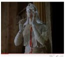 film straight away.
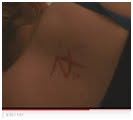
The difference is that in stigmata the blood is coming from a statue and in our film the blood is on a real person.
Also in both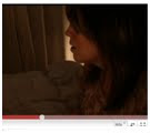 films, slow motion is used to add to the mysteriousness of what is going on
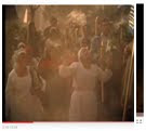 . In Stigmata the slowmotion is happening with the people around the town before anything violent has happened. In our film the possesed person and the branded symbol are in slow motion after the attack.
2) How does your media product represent particular social groups?
In our film there are no males in it however in the scene where Kate is attacked Scarlett takes on a role more suited for a male. She is aggressive and violent and that’s not a way in which females are usually portrayed, therefore challenging the female stereotype. The three girls used as actors in the film are all white working/middle class girls and are portrayed in the way they would be in real life. In the scene in the kitchen the mum seems like a friendly, loving mother and both the girls like normal sisters would be. However when Scarlett snatches the book off Kate that’s when we start to see a different side to her character, the more angry, violent personality portrayed in the bedroom scene.
Our target audience is 15-35 year olds both male and female, Because it is a horror males will want to watch it but I think because it’s female characters it will appeal more to a female viewer.
In the fil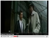 m seven the two characters in the opening sequence ar
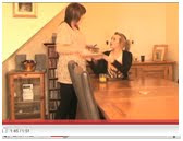 e males, which is a similarity to our film as the two characters in out film are of the same sex. One difference is that in seven the two men only know each other through work where as in ours they are sisters.
3) What kind of media institution might distribute your media product and why?
I think out film could be produced by a major Hollywood studio because horror films are loved by many, however some don’t like horror film because they find them too scary. I think our film could be a blockbuster because it isn’t too scary so I think it will appeal to people who have before been too scared to watch some horror films and will appeal to pervious horror film lovers as well so it would get lots of viewers wanting to see it. Our film is similar to the exorcist as it is a psychopath horror that has lots of quick cuts and screaming.
Our film would be shown in cinema chains such as vue or cineworld because I believe it would have lots of people wanting to watch it and there are these cinema chains all over the world. After it would be shown as a TV movie and released on DVD to give people another opportunity to view our film.
I think out film does offer a lot of opportunity for merchandise as do a lot of other horror films such as the exorcist and many others. The villain is the main target for merchandise within out film and lots of posters could be made of our villain and little figures.
4) Who would be the audience for your media product?
The target audiences for our film are male and female aged 15-35. Because it is a horror film and there is blood in it and it is scary, as people get older they don’t like to watch films that will scare them or that are bloody and gory so we put aged up to 35. People that are older than this can watch the film but we put 35 as a recommendation. We also put it as a 35 because the main actors are teenagers so will appeal more to a younger audience.
Stigmata is rated a 15 like our film and because the content of the film is similar with the branding then it will attract a similar audience of both males and females because of the violent nature of the films and also the same age range. Stigmata would attract people who are interested in religion and demons.
Our film wouldn’t be suitable from anyone under 15 because it could be too scary and disturbing for them and could mentally affect them.
http://www.bbfc.co.uk/downloads/pub/Guidelines/BBFC%20Classification%20Guidelines%202009.pdfco.uk/downloads/pub/Guidelines/BBFC%20Classification%20Guidelines%202009.pdf
5) How did you attract/address your audience?
By having teenagers as the main focus of the film, other teenagers watching will be able to relate to them and make them want to watch it. Because the actors in the film are girls then girls will be able to ide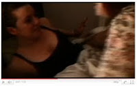 ntify more with the characters but also male viewers of a similar age will recognize the actions that are typical of all teenagers.
The part where Scarlett is attacking her sister could terrify younger female viewers because sisters are supposed to have a loving relationship. This could fright some of the less mature viewers, especially with sisters.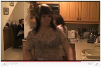
This will appeal to families that are watching it as they will understand what a regular family life is like.
There are a lot of shots from Kate’s point of view and this allows the audience to get insid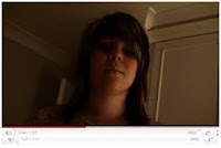 e Kate’s head and see what she is seeing.
In this shot the audience are forced to put themselves in the position of Kate as she realises that her sister has been possessed. This automatically makes the audience scared for Kate’s sake and they are terrified of what’s going to happen next because it feels like it’s happening to whoever is watching.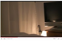
This clip is a hand held shot of Kate looking round her room after she has heard scratching at her door and allows the audience to look at exactly what she is looking at so they can identify with Kate’s feelings. This creates suspense for the audience because they can’t see the rest of the room leaving the viewer in suspense of what else they could possibly see if it was a normal shot
In our film we incorporate genetic conventions such as blood and screaming for example in the first scene, Kate is screaming and panicking and there’s blood from where Scarlett scratches the symbol into Kate’s back. Darkness is a particular generic convention for the Horror genre we chose therefore that’s why we decided to make the room as dark as we could.
I think our film challenges a few of the generic conventions of a horror film as in the way the victim and villain are established straight away in the first scene. We decided to put the scene where Kate gets attacked first and our ‘normal day’ scene afterwards to challenge the regular structure of horror films. We did this to get the audience interested straight away and to keep them watching to find out why it had happened. Our film also challenges the blood and gore usually associated with horror films, although there is blood, there isn’t a lot as we didn’t want to overdo it and make it look too unrealistic.
I think the conventions we have used do indicate that our film is a psychological horror film. This is because of the mysterious mood created in the bedroom by the restlessness of Kate and the darkness and fear created within the scene. Also the fact that the kitchen scene seems like such a normal day makes it less likely to be a vampire or monster horror.
Other films that have influenced our film are films like stigmata. In Stigmata an ordinary young woman is affected by mysterious wounds called Stigmata. A Catholic Priest investigates and discovers this woman may be possessed by someone, or something and a message originating from the time of Jesus Christ. In our film we decided we would have Kate branded with some kind of symbol and also Scarlett, her sister, would be possessed and would be the one that brands her.
In stigmata and our film, blood is seen in both of the opening sequences and this shows that it is a horror
 film straight away.
The difference is that in stigmata the blood is coming from a statue and in our film the blood is on a real person.
Also in both
 films, slow motion is used to add to the mysteriousness of what is going on
 . In Stigmata the slowmotion is happening with the people around the town before anything violent has happened. In our film the possesed person and the branded symbol are in slow motion after the attack.
2) How does your media product represent particular social groups?
In our film there are no males in it however in the scene where Kate is attacked Scarlett takes on a role more suited for a male. She is aggressive and violent and that’s not a way in which females are usually portrayed, therefore challenging the female stereotype. The three girls used as actors in the film are all white working/middle class girls and are portrayed in the way they would be in real life. In the scene in the kitchen the mum seems like a friendly, loving mother and both the girls like normal sisters would be. However when Scarlett snatches the book off Kate that’s when we start to see a different side to her character, the more angry, violent personality portrayed in the bedroom scene.
Our target audience is 15-35 year olds both male and female, Because it is a horror males will want to watch it but I think because it’s female characters it will appeal more to a female viewer.
In the fil
 m seven the two characters in the opening sequence ar
 e males, which is a similarity to our film as the two characters in out film are of the same sex. One difference is that in seven the two men only know each other through work where as in ours they are sisters.
3) What kind of media institution might distribute your media product and why?
I think out film could be produced by a major Hollywood studio because horror films are loved by many, however some don’t like horror film because they find them too scary. I think our film could be a blockbuster because it isn’t too scary so I think it will appeal to people who have before been too scared to watch some horror films and will appeal to pervious horror film lovers as well so it would get lots of viewers wanting to see it. Our film is similar to the exorcist as it is a psychopath horror that has lots of quick cuts and screaming.
Our film would be shown in cinema chains such as vue or cineworld because I believe it would have lots of people wanting to watch it and there are these cinema chains all over the world. After it would be shown as a TV movie and released on DVD to give people another opportunity to view our film.
I think out film does offer a lot of opportunity for merchandise as do a lot of other horror films such as the exorcist and many others. The villain is the main target for merchandise within out film and lots of posters could be made of our villain and little figures.

4) Who would be the audience for your media product?
The target audiences for our film are male and female aged 15-35. Because it is a horror film and there is blood in it and it is scary, as people get older they don’t like to watch films that will scare them or that are bloody and gory so we put aged up to 35. People that are older than this can watch the film but we put 35 as a recommendation. We also put it as a 35 because the main actors are teenagers so will appeal more to a younger audience.
Stigmata is rated a 15 like our film and because the content of the film is similar with the branding then it will attract a similar audience of both males and females because of the violent nature of the films and also the same age range. Stigmata would attract people who are interested in religion and demons.
Our film wouldn’t be suitable from anyone under 15 because it could be too scary and disturbing for them and could mentally affect them.
http://www.bbfc.co.uk/downloads/pub/Guidelines/BBFC%20Classification%20Guidelines%202009.pdfco.uk/downloads/pub/Guidelines/BBFC%20Classification%20Guidelines%202009.pdf
5) How did you attract/address your audience?
By having teenagers as the main focus of the film, other teenagers watching will be able to relate to them and make them want to watch it. Because the actors in the film are girls then girls will be able to ide
 ntify more with the characters but also male viewers of a similar age will recognize the actions that are typical of all teenagers.
The part where Scarlett is attacking her sister could terrify younger female viewers because sisters are supposed to have a loving relationship. This could fright some of the less mature viewers, especially with sisters.

This will appeal to families that are watching it as they will understand what a regular family life is like.
There are a lot of shots from Kate’s point of view and this allows the audience to get insid
 e Kate’s head and see what she is seeing.
In this shot the audience are forced to put themselves in the position of Kate as she realises that her sister has been possessed. This automatically makes the audience scared for Kate’s sake and they are terrified of what’s going to happen next because it feels like it’s happening to whoever is watching.

This clip is a hand held shot of Kate looking round her room after she has heard scratching at her door and allows the audience to look at exactly what she is looking at so they can identify with Kate’s feelings. This creates suspense for the audience because they can’t see the rest of the room leaving the viewer in suspense of what else they could possibly see if it was a normal shot
6) What have you learnt about technology from the process of constructing the product?
One w eakness on the camera equipment was how big and heavy it was, it was difficult to carry back to my house because it was big and heavy and it was hard not to bang it or damage it.
One strength of the equipment we used was that it was easy to use and it was good quality which made it feel professional.
During the filming process, the tripod caused a problem because it had got stuck so we couldn’t get the leg down and it took a long time to fix it so while one person was doing that we were getting the set ready and make-up etc. so that we weren’t time wasting. Also, we found that in the rooms we were filming, there wasn’t enough room for the camera to get some of the shots we would have liked.
The editing software we used was final cut express because it was be tter than imovie. We uploaded all the shots off a DV player onto the software and made rough cuts and put the shots in order then all we had to do was edit it properly. We used this software to be able to change the colour of the shots so that there was more continuity.
7) Looking back to your preliminary task, what do you feel that you have learnt in the progression from it to the full product?
Firstly we decided we wanted to do a horror, After looking through some books we found of horror films that have been story boarded it helped us realise what kind of shots we needed to create the most tension for example medium shots on facial expressions.
By looking at similar films to ours it also helped us decided which would be the best order to our film to make it run smoothly and also create the most tension for the viewer to stay interested throughout.
From doing our preliminary task it helped us get used to the camera for example how we needed to position it to get everything we needed into one shot. It also helped us get used to doing the same thing over and over again to allow us to get shots from different angles that would cut together properly.
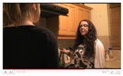
By having practiced shot-reverse-shot.
One w
 eakness on the camera equipment was how big and heavy it was, it was difficult to carry back to my house because it was big and heavy and it was hard not to bang it or damage it.
One strength of the equipment we used was that it was easy to use and it was good quality which made it feel professional.
During the filming process, the tripod caused a problem because it had got stuck so we couldn’t get the leg down and it took a long time to fix it so while one person was doing that we were getting the set ready and make-up etc. so that we weren’t time wasting. Also, we found that in the rooms we were filming, there wasn’t enough room for the camera to get some of the shots we would have liked.

The editing software we used was final cut express because it was be tter than imovie. We uploaded all the shots off a DV player onto the software and made rough cuts and put the shots in order then all we had to do was edit it properly. We used this software to be able to change the colour of the shots so that there was more continuity.
7) Looking back to your preliminary task, what do you feel that you have learnt in the progression from it to the full product?

Firstly we decided we wanted to do a horror, After looking through some books we found of horror films that have been story boarded it helped us realise what kind of shots we needed to create the most tension for example medium shots on facial expressions.
By looking at similar films to ours it also helped us decided which would be the best order to our film to make it run smoothly and also create the most tension for the viewer to stay interested throughout.
From doing our preliminary task it helped us get used to the camera for example how we needed to position it to get everything we needed into one shot. It also helped us get used to doing the same thing over and over again to allow us to get shots from different angles that would cut together properly.
By having practiced shot-reverse-shot.

and match on action,
it made us better at it the second time round and I think we did a good job in our film. I think our end project does fulfill the task we set out to achieve
We got a sample of our target audience to comment on our film and these are some of the thing they had to say:
We had intriguing music because it linked with horror but it was a little confusing until the end when they realised it was a flashback.
Camera angles were good and showed who was in power and also the slow motion and the text on the title sequence was good.
The title sequence was intruging and the film was scary and intruguing and liked that it ended on a cliffhanger. Heres a link to our audience feedback
10 Minute Film Analysis - The Omen
The Omen is a similar film to the one we are going to create, except it has certificate rating 18. I watched the opening sequence (first 10 minutes) of the film and analysed the camera shots, editing, sound and mise-en-scene to help come up with ideas for our film. Other elements that I took notice of were the story line, title sequence, and characters.
The title sequence of the film represents the genre, psychological horror, instantly. The overall image is really dark, which links to the generic convention of horror films of darkness. It is based on a black background with the text in bold white font. There is a red image on each of the screens also, of a boy and an antichrist cross. This shows that the film will have a religious theme, and the fact that the two images are shown as one implies the possession of the child. There is music throughout the title sequence which is quite orchestral and eerie. It starts off quite low with male voices and a steady beat but comes to a climax at the end of the titles with the director’s name, alot quicker, with women’s high pitched voices.
Following the title sequence is the first scene of the film. There is no establishing shot, which is unusual. Instead there is alot of quick editing and cuts between a close up of a man’s face, the car he is in, and the streets he is driving on. His face is only lit by the lights on the street which makes him look really mysterious however in the flashes of light we get a glimpse of his suit, which implies he is quite wealthy. There is a non-diegetic voice over in this scene which explains why the man has come to be where he is. The final words of the voice over are “the child is dead”. This gives an explanation to the storyline as the film jumps into the story, introducing the characters as it goes along. This is a technique I think would be effective for us to use as it will capture the audience straight away. The man arrives at a hospital which is established by a high angle shot, which is captured through the banister of a high balcony. The wood appears to be a frame for the image but gives the impression that the characters being focused on are being watched, or that someone is hiding. This feeling of being watched makes the audience question what or who it could be, and builds up more suspense. There is a graphic match between a close up of his face and a close up of a baby. The nurses at the hospital are all nuns, clearly shown by their costumes, and alot of the decorations around the rooms are all religious items, this again emphasises the religious theme of the film. There is a shot of the man from the first scene looking at the baby. His expressions and the tone of the non-diegetic music show that something isn’t right and it is here that the voice over at the beginning falls into place. The shot isn’t a regular shot of him looking at the child though, it is shown cleverly using a reflection from a glass window, giving a ghostly image that looks really effective.
We then follow the apparent main character to his home and there is a jump in time, which is very extravagant and clearly shows wealth. The story develops and we find out that his family will be moving. By this point the baby is young child. I think the jump in time is effective because the audience still know who the boy is, and therefore everything is still relevant. There are alot of mid shots to show the families faces as the husband breaks the news that his family will have to move due to his promotion. The non-diegetic music at this point is quite uplifting and light, but everything seems too good to be true. It makes the audience expect something bad.
As we follow the family to their new home it is even bigger and grander than the last. The family seems to be really happy but it becomes obvious that the husband is hiding something from his wife. The child she is bringing up as her own isn’t, but he doesn’t want her to know. Each shot of the family is a high angle shot which represents their authority and wealth. I think this is also done in preparation for the mental and physical ordeals the family will go through later in the film. They are portrayed as really friendly and happy to create a close relationship between them and the audience, this gets the audience more involved and in turn makes them more scared. This close audience-character relationship is something which I think our film would benefit from as the audience would stay interested for longer.
I think that in the opening to The Omen, there are no particularly scary bits. The suspense and tension is built up gradually and the audience gets to learn about the family. I think this is important as it helps the audience follow the story but I think to make our film individual it would be a good idea to have some of the action first. This would captivate the audience and make them want to know what had happened to make things how they are. The use of music is really effective and really helps set the mood for the film. I think this is key if we want our film to be a successful psychological horror.
10 minute film analysis- Stigmata
In the first part of the title sequence where its introducing the film company etc it starts with the sun rising like a normal day but when the shot changes all the lighting is slightly orange but not bright as would be expected with the sunshine so this immediately triggers something isn’t quite right. The writing for the title sequence is strange and looks like foreign writing or symbols then change to English, the writing flickers up and down and moves about the scene to make it seem like its been possessed by something.
The music during the opening sounds like a ghost and it makes it sound very sinister and creepy, this give an insight into what the film is going to be like. After the first scene when the introduction of the characters starts in the second part of the title sequence, the mood of the film changes and so does the music. It changes from a spooky ghostlike noise to a heavy rock club song with a much more happy feeling to it which contrasts with the previous music.
When the first scene opens it starts with lots of close ups of a man writing strange writing on a piece of old looking paper. There are lots of close ups alternating between the paper, the man’s mysterious face and the rosary beads he is holding. The rosary beads give the initial religious connection and the viewer is forced to focus on that, also the viewer are forced to realise that the man must be very important by showing a lot of close ups of him and immediately wonder what it is that must be so important for him to be the only character in the first part of the film.
The two people i would consider to be the main focus in the first 10 minutes of this film are the man who is shown from the very beginning and the man who is walking through the crowd with the sunglasses on. These are both male characters which backs up that males are stereotypically the more dominant gender and that stereotypically years back females were not seen as important. This is shown in that all the females to begin with are shown all doing the same thing bowing which infers that they are not individuals and that they are respecting something more superior to themselves.
The main dominant man is well identified as he has a completely contrasting costume to the rest of the people in the background. Everyone else in the crowd are wearing robes that are mainly white and red but the main man is wearing a black jacket with black sunglasses so the audience are immediately attracted to him but for what reason they don’t know yet. The town in which the film is set to begin with is very crowded and all the people in the background seem to be slightly out of focus and in slow motion, however the camera is following the main man at all times and his colour isn’t faded, it’s bright which makes him stand out even more.
There are a few eyeline matches between the main man and what he is looking at for example when he looks at the candles and they go out. By doing this it allows the audience to be put in his position and by doing so makes the audience feel they can relate to this character by seeing what he sees.
There is a very high angle shot of the statue with blood pouring down it and they audience are automatically drawn to this because it is the first high angle shot in the film which means the statue being showed in it must be very important. By showing it in such a high angle it means that it must be very superior and must have an important role within the film. When the statue is shown it shows a long shot of the crowd in the church doing the cross on their chest which backs up that it is a respected figure.
There is a low angle shot of a woman carrying a cross which must imply that the woman isn’t very important and that she is looked down upon which is stereotypical for women to be looked down upon by men and also other important figures of authority because men are more important. Its a contrast showing the cross in a low angle shot because that would infer that t was looked down upon and not important, however that’s the opposite image they are trying to create. They are trying to convey the importance of religion throughout buy having close up and medium shots of the cross and other religious symbols. There are also low angle shots of most other people apart from the cross and the main actor in the film meaning that they are the superior characters. There are also close ups of everything the man does for example when he takes swabs of the blood from the statue, this is intentional to make the audience watch what he is doing and realise it must have some significance.
After the scene in the church when the second lot of titles start the setting completely changes to a club where the lighting is no longer grey and instead is very bright which would infer it has turned into a normal day again however all the way through there are religious symbols flashing up all the way through and the pieces of paper with strange writing on shown in the same yellow tint and darkness as before to convey that it isn’t a normal day after all.
This film relates to the same genre as ours because there are specific conventions throughout that make me know it is a horror film. There is blood, screaming, churches and darkness.
In our film we used a few things that were similar, for example we chose to make the writing in our title sequence jump and move about to create the idea that everything is not right. We also used the idea of having some old looking paper with symbols on it, we thought this looked good as people wouldn’t know what the symbols were straight away and therefore leave the audience in suspense. Another thing we did similar was after having the horror scene to start with which had the blood in it it then went on to be a normal day just like in the Stigmata film but another thing we did which was similar is to keep the symbols in it to give the idea everything isn’t really normal just like stigmata did with the religious images.
Evaluation
1. In what way does your media project use, develop, or challenge forms and conventions of media products? 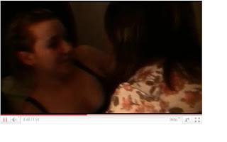
I think our project uses generic conventions for a horror movie, like darkness. In the scene where Kate is attacked by Scarlett the lighting is very dim. This scene also makes it easy to tell who is the victim and the villain. Again in the first scene like a horror movie, there is blood and screaming.
It challenge generic conventions because it tones the horror genre slightly down, so to not be as scary and gory as and certificate 18 would be, because it’s a 15. Also horror movies normally go straight into a normal setting and atmosphere whereas ours shows you the main idea and plot of the film within the first minute.
The theme of psychological horror shows through in the way that Scarlett reads her books and has the old symbol paper. To learn a little about this, I watched films such as the Exorcist, Rosemary’s Baby and The Omen. Also, because the scene of the family in the kitchen is such a normal day to day thing, it couldn’t be a vampire or monster genre because that wouldn’t happen; the setting wouldn’t be like that.
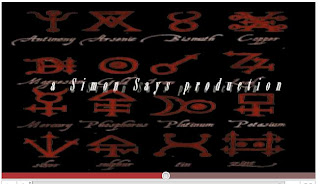
The title sequence to Se7en was an inspiration, as that has quick cuts of different things. It is quite fast and shaky, as we intended ours to be.
2. How does your media product represent particular social groups?
All the characters and actors in our film are female, therefore there is no stereotypical dominant male but there is a passive female, Kate. Our film challenges stereotypes in the way that Scarlett is an aggressive girl, possessed and going ahead to hurt her o wn family. However Kate and the mother are represented stereotypically. For example the mother making breakfast, and Kate being passive and sweet throughout.
Our target audience is from 15 to 35 year olds of both sexes. Because it is a horror, both sexes will want to see and enjoy the film, although with an all female cast, it may appeal to females in other ways.
3. What kind of media institution might distribute your media product and why?
I think our film could be produced by a major Hollywood studio because it is slightly similar to other existing products, this way you know there is a market for our genre. I also think it has a little bit of originality that would make it appealing, like something fresh on the market. A lot of people enjoy horror movies, however there are people that find them too scary, and others that say there is not enough horror in the movie. Our film is similar to the Exorcist, due to quick cuts and lots of screaming and noise.
It would be shown in well known cinema chains such as Vue and Cineworld because lots of people would want to watch it. After it could go onto DVD and Blu-Ray, then after a couple of years be shown on television.
There is an opportunity for merchandising and other products, maybe figurines of Scarlett as the villain. Also posters and soundtracks could be sold as a way of promoting and distributing.
4. Who would be the audience for your media product?
Our target audience is 15-35 year olds of both sexes. There is no particular gender target as horror films appeal to lots of people. The age target is set as it is because people younger than fifteen and older than 35 may not wish to see blood and violence, as this could emotionally upset or disturb them. Another reason for the 35 year old recommendation is the fact that the actors are teenagers, therefore may attra ct a younger audience, and may not appeal as much as middle aged actors would.
Stigmata is a film also rated with a 15 certificate. The content in Stigmata is similar to our film because of the branding, therefore attracting a similar sort of audience along with it. Both films would attract people interested in demons, and the possession transformation.
http://www.bbfc.co.uk/downloads/pub/Guidelines/BBFC%20Classification%20Guidelines%202009.pdf
5. How did you attract/address your audience?
As the two main characters of the film are teenagers, I think this would attract a younger audience. Along with the point of view shots we have during all the scenes, the younger audience will find it easy to address the more simple situations of the film. Also, older people with the interest in demons and possession , as I have earlier mentioned will be attracted to our film. Overall the audience are pushed to feel for Kate because of the things she is going through and the situation she is in. Especially when she sees the symbols in the book and realizes the truth. With Scarlett being her sister, Kate is stuck in between her safety and well-being and her family. The audience should be scared for Kate as it is unknown what will happen to her. This creates suspense and gets the audience thinking about the plot and further events, and hopefully some understanding.
6. What have you learnt about technology from the process of constructing the product?
To make our film we used a piece of equipment new to us, the Sony HDV 1000. The camera has its own microphone, auto function and brilliant battery life. The microphone mad e the editing process a lot smoother as we didn’t have to use a separate tape for sound. The auto function meant it was more or less already in perfect focus, and battery life meant we had no annoying interruptions.
The fact we had to carry the heavy camera equipment a long way from college and on public transport was a little bit of an issue. Also because it was rather large along with the tripod, we had trouble fitting it in rooms to get a shot of the entire room.
We also encountered a problem in which we thought one of the tripod legs was broke. This was because before we used the tripod; it had not been put away properly, causing the poles to be out of place. We quickly solved this with a bit of team effort, it also taught us to always check we’d put things away properly.
The programme we used to edit was ‘Final Cut Express’. This seemed overwhelming at first, but when we got used to it it was rather simple. The features and effects we were able to put on certainly added to create mystery and set the scene of our film. For instance, the white and black fading used throughout. Also, when we filmed during the day and the rooms were too bright, we were able to change the contrast and lighting th rough this programme. We also used this to create our title sequence, as it had lots of options in order for us to be able to create exactly what we wanted. Like the shakiness, and the font, and colours that tied in with our film. The title sequence to Se7en was an inspiration, as that has quick cuts of different things. It is quite fast and shaky, as we intended ours to be.
7. Looking back to your preliminary task, what do you feel that you have learnt in the progression from it to the full product?
We began planning our film by research into genres. As a group we decided on horror because it sounded like an exciting and interesting thing to go into, especially the research and filming aspects. We also liked the fact we’d be able to play around with it in ways such as themes, setting and lighting. We decided on a theme of psychological horror, and from there planned story lines and script. We looked into the generic conventions and a lot of this was done on the internet. We did a list of shots we planned to use and this came in very handy when we doing the shots, as it made things run a lot smoother, and also saved us a lot of time. Compared to the planning of our preliminary task, this time we went into more detail with things.
Compared to our shot list, in the preliminary task the shots were very limited. It was one of the first filming tasks in our Media lesson and we had a much smaller camera on which to do so. In particular the point of view shots, which helps the audience connect and get into the film a lot more. Like Scarlett looking at the branding on Kate’s back and Kate finding the symbols. Overall I think we had come a long way from our preliminary task, as our actual film was much more planned out, and definitely more professional.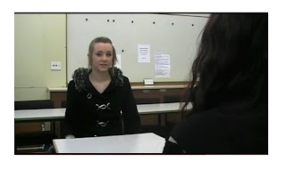
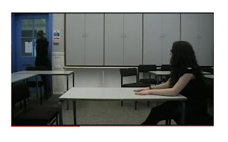
We asked a sample of our target audience to comment on our film. They gave answers such as; intriguing music that linked to the genre of the film because it was a horror, quite confusing at the beginning because you couldn't tell that it was a flash back. Overall intriguing and left quite a good cliffhanger. Good opening sequence, music added to the atmosphere. Camera angles showed which characters were in power. Slow motion text sequence was good. Shaky start, but adds to mystery of horror genre. Non digetic sound was good but digetic sound needed improving. Faded in on moments of tension.
The link to our audience feedback is http://www.youtube.com/watch?v=zUHRidOdyMI

I think our project uses generic conventions for a horror movie, like darkness. In the scene where Kate is attacked by Scarlett the lighting is very dim. This scene also makes it easy to tell who is the victim and the villain. Again in the first scene like a horror movie, there is blood and screaming.
It challenge generic conventions because it tones the horror genre slightly down, so to not be as scary and gory as and certificate 18 would be, because it’s a 15. Also horror movies normally go straight into a normal setting and atmosphere whereas ours shows you the main idea and plot of the film within the first minute.
The theme of psychological horror shows through in the way that Scarlett reads her books and has the old symbol paper. To learn a little about this, I watched films such as the Exorcist, Rosemary’s Baby and The Omen. Also, because the scene of the family in the kitchen is such a normal day to day thing, it couldn’t be a vampire or monster genre because that wouldn’t happen; the setting wouldn’t be
 like that.
The title sequence to Se7en was an inspiration, as that has quick cuts of different things. It is quite fast and shaky, as we intended ours to be.
2. How does your media product represent particular social groups?
All the characters and actors in our film are female, therefore there is no stereotypical dominant male but there is a passive female, Kate. Our film challenges stereotypes in the way that Scarlett is an aggressive girl, possessed and going ahead to hurt her o
 wn family. However Kate and the mother are represented stereotypically. For example the mother making breakfast, and Kate being passive and sweet throughout.
Our target audience is from 15 to 35 year olds of both sexes. Because it is a horror, both sexes will want to see and enjoy the film, although with an all female cast, it may appeal to females in other ways.
3. What kind of media institution might distribute your media product and why?
I think our film could be produced by a major Hollywood studio because it is slightly similar to other existing products, this way you know there is a market for our genre. I also think it has a little bit of originality that would make it appealing, like something fresh on the market. A lot of people enjoy horror movies,
 however there are people that find them too scary, and others that say there is not enough horror in the movie. Our film is similar to the Exorcist, due to quick cuts and lots of screaming and noise.
It would be shown in well known cinema chains such as Vue and Cineworld because lots of people would want to watch it. After it could go onto DVD and Blu-Ray, then after a couple of years be shown on television.
There is an opportunity for merchandising and other products, maybe figurines of Scarlett as the villain. Also posters and soundtracks could be sold as a way of promoting and distributing.
4. Who would be the audience for your media product?
Our target audience is 15-35 year olds of both sexes. There is no particular gender target as horror films appeal to lots of people. The age target is set as it is because people younger than fifteen and older than 35 may not wish to see blood and violence, as this could emotionally upset or disturb them. Another reason for the 35 year old recommendation is the fact that the actors are teenagers, therefore may attra
 ct a younger audience, and may not appeal as much as middle aged actors would.
Stigmata is a film also rated with a 15 certificate. The content in Stigmata is similar to our film because of the branding, therefore attracting a similar sort of audience along with it. Both films would attract people interested in demons, and the possession transformation.
http://www.bbfc.co.uk/downloads/pub/Guidelines/BBFC%20Classification%20Guidelines%202009.pdf
5. How did you attract/address your audience?
As the two main characters of the film are teenagers, I think this would attract a younger audience. Along with the point of view shots we have during all the scenes, the younger audience will find it easy to address the more simple situations of the film. Also, older people with the interest in demons and possession
 , as I have earlier mentioned will be attracted to our film. Overall the audience are pushed to feel for Kate because of the things she is going through and the situation she is in. Especially when she sees the symbols in the book and realizes the truth. With Scarlett being her sister, Kate is stuck in between her safety and well-being and her family. The audience should be scared for Kate as it is unknown what will happen to her. This creates suspense and gets the audience thinking about the plot and further events, and hopefully some understanding.
6. What have you learnt about technology from the process of constructing the product?
To make our film we used a piece of equipment new to us, the Sony HDV 1000. The camera has its own microphone, auto function and brilliant battery life. The microphone mad
 e the editing process a lot smoother as we didn’t have to use a separate tape for sound. The auto function meant it was more or less already in perfect focus, and battery life meant we had no annoying interruptions.
The fact we had to carry the heavy camera equipment a long way from college and on public transport was a little bit of an issue. Also because it was rather large along with the tripod, we had trouble fitting it in rooms to get a shot of the entire room.
We also encountered a problem in which we thought one of the tripod legs was broke. This was because before we used the tripod; it had not been put away properly, causing the poles to be out of place. We quickly solved this with a bit of team effort, it also taught us to always check we’d put things away properly.
The programme we used to edit was ‘Final Cut Express’. This seemed overwhelming at first, but when we got used to it it was rather simple. The features and effects we were able to put on certainly added to create mystery and set the scene of our film. For instance, the white and black fading used throughout. Also, when we filmed during the day and the rooms were too bright, we were able to change the contrast and lighting th
 rough this programme. We also used this to create our title sequence, as it had lots of options in order for us to be able to create exactly what we wanted. Like the shakiness, and the font, and colours that tied in with our film. The title sequence to Se7en was an inspiration, as that has quick cuts of different things. It is quite fast and shaky, as we intended ours to be.
7. Looking back to your preliminary task, what do you feel that you have learnt in the progression from it to the full product?
We began planning our film by research into genres. As a group we decided on horror because it sounded like an exciting and interesting thing to go into, especially the research and filming aspects. We also liked the fact we’d be able to play around with it in ways such as themes, setting and lighting. We decided on a theme of psychological horror, and from there planned story lines and script. We looked into the generic conventions and a lot of this was done on the internet. We did a list of shots we planned to use and this came in very handy when we doing the shots, as it made things run a lot smoother, and also saved us a lot of time. Compared to the planning of our preliminary task, this time we went into more detail with things.
Compared to our shot list, in the preliminary task the shots were very limited. It was one of the first filming tasks in our Media lesson and we had a much smaller camera on which to do so. In particular the point of view shots, which helps the audience connect and get into the film a lot more. Like Scarlett looking at the branding on Kate’s back and Kate finding the symbols. Overall I think we had come a long way from our preliminary task, as our actual film was much more planned out, and definitely more professional.


We asked a sample of our target audience to comment on our film. They gave answers such as; intriguing music that linked to the genre of the film because it was a horror, quite confusing at the beginning because you couldn't tell that it was a flash back. Overall intriguing and left quite a good cliffhanger. Good opening sequence, music added to the atmosphere. Camera angles showed which characters were in power. Slow motion text sequence was good. Shaky start, but adds to mystery of horror genre. Non digetic sound was good but digetic sound needed improving. Faded in on moments of tension.
The link to our audience feedback is http://www.youtube.com/watch?v=zUHRidOdyMI
Subscribe to:
Comments (Atom)


